3.31.2009

mix 'n' match


recently i've been thinking that it would be great if the 3D character models could carry over from game to game on PS3 or xbox 360 the way a "Mii" can on nintendo wii. specifically, it'd be great to play skate 2 as street fighter 4 characters.

you could do the same thing with 3D environments, too. how great would it be to bring in your skate physics and ride around inside a halo level? or star wars battlefront?!

dude, i can't wait for the future.

3.30.2009

ryu wins. perfect.


actually, this comic was going pretty well - maybe i'll still finish it. this comic was inspired by my early enthusiasm for street fighter 4. i wanted to draw some of the characters, but didn't have a plan.

this comic is the most recent in a long tradition of art depicting the death of my former coworker "hays." back in college, i made a terrible geocities website to host all these "dead hays" drawings and comics, a site which will probably have dissolved by the time anyone ever clicks this link: website of dead hays.

UPDATE: free geocities pages have indeed become defunct.

3.29.2009

film critique


i had originally included edward norton's american history x tattoo as another way to tell the 2 hulks apart, but that doesn't work out so well when you accidentally give it to both of them in the same panel.

i think the reason i never finished this one was that the references were becoming increasingly obscure and i didn't know how to get past the escalating violence. sometimes i'm not "making a comic" as much as "drawing people fighting" with a tacked-on ending.

3.28.2009

aimless comics #1


i realized today that this comic, which i totally believed i'd finish one day, has been sitting in my "immediate-access" drawer at work for over a year. just now, blogging, i realized that "droor" is not a word.

this would have been a sequel to parts one and two, if there had been anyplace to take it (wow, i really enjoyed using "anyplace" as one word just now). unfinished, you can see all the mistakes that normally i would have photoshopped out.

in case you don't know, daxflame is a hilariously awkward kid with a (fake?) youtube channel.
my favorite dax videos include:
1. halloween special
2. a convienient truth
3. a christmas carol's dead

the scooter reference comes from his other channel, BerniceJauchTalk.

3.27.2009

bar-bar-bara anne


i find it odd that conan the barbarian, a model of masculine instinct, has bangs. how often does he get them trimmed?

this is also the day that i decided it's fun to draw wolverine's hair, but not his mask. those wings on his head don't make spacial sense - no wonder the movie had to skip the costumes.

in the bottom right is my freehand attempt at the weapon x helmet. the ones on the left were referenced on google images, but even then you can't really tell what's going on. still wish i was better at tech gibberish.

3.18.2009

free (notepad) association


a random sampling of some things i think about over the course of the day.

3.17.2009

spider-man practice.


what if all these poses were part of one fight sequence against just me? or, i dunno, a dance routine.

3.16.2009

arf.


this page started out as rorschach practice, but when i moved on to an action shot (top right), i got hung up on why my dogs don't look right. 13 dogs later, i'm not sure how much closer i got.

eventually i worked my way back to the watchmen theme, but not before being compelled to copy john locke's pose from a LOST promo i happened across.

3.15.2009

who doodles the watchmen?


last week, i had been working out how to draw "nite owl" from the watchmen, as the release date of the movie drew nearer and my excitement built, so he was where i started at our weekly meeting.

somebody must have mentioned star trek, cause captain picard and diana troy also showed up.

the female superhero is my attempt to remember atom eve's costume (from the comic "invincible"), but i forgot that she wears long sleeves and no skirt. not bad for freehand, though, i think.

and lastly, 2 more recent attempts to recreate the arm-break scene in watchmen. of course, nite owl wasn't in costume in the real scene, and this is the costume from the comic book, not the movie, but i can draw whatever i want, so leave me alone.


and speaking of watchmen, here are some earlier costume doodles, starring my good friend greg steele as the comedian and the undoodlable kyle almas as ozymandias. you can see i tried and tried to work out a way to draw kyle's face, but to no avail. that giant head looks nothing like him and is inexcusable.


i don't know if this is more or less flattering, but i really like it. a lot.

3.14.2009

metroid mania


clearly during one of my nintendo DS spells. cameos by daxflame, dana snyder in a astronaut costume, an elf and an ogre. why? i just don't know anymore.

3.13.2009

matt h.f. notepads


the world's most oddly-named podcast, "the ken p.d. snydecast" is a semi-regular anything goes hour of hilarious banter between ken plume (webmaster of quickstopentertainment.com) and dana snyder (master shake from aqua teen hunger force). this was a fan tribute i made for them after plumey mentioned his appreciation for pez dispensers on one of the early episodes.

3.12.2009

no one does, not like this.


i watched 2 seasons of "who wants to be a superhero?" on the sci-fi channel. i don't know why.

worse, i waited and waited for the feedback comic to come out. it was terrible.

3.11.2009

web swing!


my favorite thing about spider-man has always been his dexterity - the way that artists put him in these impossible poses. i don't have the hang of it yet. maybe i'm just scared to be daring, but my spideys always either look too stiff or get lost in the jumble of limbs.

3.10.2009

cowboys


cowboys and cowboy-related artifacts. my favorite is the skinny bald guy in the vest. i also like how the growling cowboy is holding his gun by the barrel - clearly an afterthought - "oh wait, cowboys are supposed to hold pistols."

looks like i had been googling different kinds of pistols, too.

3.09.2009

vikings and ogres


a viking, a viking-ogre and an ogre.

3.08.2009

more post-its


various characters intended to be included in comic strips at one time or another. some of them still haven't made it.

some have.

3.07.2009

free post-its


along with the free notepads, we office workers get all the free post-it notes we can use. the great thing about that is that such a tiny surface is far less daunting to approach with a pen. if i screw up a doodle, who cares? it's just a post-it.

so here i condensed a couple prime post-it doodles (albeit unrelated) into one stackable, savable notepad page.

on top, a group inspired by my november 2008 viewing of spamalot at chrysler hall in norfolk. black knight and john cleese both appear, as does a medieval colossus (of the x-men) and my good friend greg steele (for some reason). the others i cannot identify, even though i've left hints for myself. the true answer could be lost to the ages.

EDIT: i just realized who the other knights are - jeff goldblum and magneto. no word on the horned damsel yet.

below, battle of the hulks. from left to right: edward norton's hulk, ang lee's hulk and lou ferrigno's hulk. i started a comic strip with a fight between norton and lee, but ultimately felt that the inclusion norton's american history x swastika was in bad taste, so i never finished. maybe some day.

3.06.2009

storyboarding 2


my cubicle neighbor vince white is a graphic designer who has worked in the comic book industry and is always thinking of a project or two that could be his triumphant return. one character he created that i responded to was will power, a high school football player who is transported to the future, where he realizes his body is ultra dense and indestructible compared to other matter.

a comic fan myself, i often serve as a sounding board for vince's endless ideas and revisions. in this case, i took it upon myself to draw a storyboard of how i saw will power's origin being presented.

storyboarding 1


at times during my IT career, desperate measures must be taken to fill the gaps in workflow. one way to kill a good chunk of hours is to write something, and i couple of times i've tried my hand at a long form comic book script. this page is a practice run of how the storytelling would move forward, if not the exact layout or style.

this was an idea my work friend vince white and i used to chat about. it takes place in a world where countries are represented by single warriors rather than whole military forces, and special ops teams would hunt down the runner in a high-stakes game of capture the flag that would determine the outcome of each war.

3.05.2009

schmeath schmedger


i feel like the technique here is pretty decent, but i've never been good at portraiture. that's why these are in pencil - without the ability to erase i would have quickly gotten too frustrated to go on.

the other thing is that you can see me reducing the detail in these little by little until i have a model for the heath ledger comic. it still didn't come out all that recognizable.

3.04.2009

axe attack


this is from one our weekly friday meetings at work, where about a dozen of us get together to report on what we've spent the week doing. or in my case, to doodle while a bunch of backend programming talk goes way over my head.

the week i drew this, i was finishing up the lord of the rings trilogy (in book and film forms), so i was clearly preoccupied with fantasy imagery (and again, drawing myself).

this was also a study for using myself as a character in my acusor comic strips, although needlessly intricate, in retrospect.

i threw an elf woman in there so that if anybody noticed my doodles, it wouldn't be all shirtless men. i'm terrible at drawing females. there's an elusive balance between simple and feminine that i haven't figured out exactly how to translate yet. anyway, she ended up in the comic, too.

not sure why one of the matts came out bald.

family matters


i was confused about the chronology of this one but i think i have it figured out now. you can see the date has been changed - i think because i had dated it retroactively in january 2008, forgetting that the previous month had occured in 2007. it makes sense because that's the year that steve, carly and the twins (pictured) were in town for xmas.

while they were here, we saw steve play in a soccer game with his old teammates, hence the outfit and juggling. what we did not see was laura doing a skateboard trick. artistic license, i guess. maybe that was around the time i first got my hands on "skate" for xbox 360.

mom and dad make a rare appearance here as well. what's more predictable is that something normal (like baby nephews) made me think of something nerdy to draw (like robot suits inspired by a half-remembered arcade game from the pizza hut by my house as a kid).

thanks a lot, brain.

3.03.2009

grabby


i don't now why i wrote "cripple" on this. maybe my hand hurt that day. maybe trying to draw without thinking caused a side effect of writing without thinking.

what i like about these contour drawings is that the proportions come out exaggerated. look how the thumb sticks way out and the wrist is so thin by comparison. if i'd tried to do that on purpose, it would have come out looking forced.

a bird in the hand


it's so annoying when you're trying to draw someone but they keep moving.

self-portrait


i'd say somewhere around 75% of everything i draw is of myself. that either makes me self-centered or introspective, depending on how big a jerk you are.

i like to experiment with this style every once in a while. i consider it contour drawing even though i use a little shading. the idea is to just put pen to paper and draw continuously without planning. you end up with something more abstract, less conscious and often pretty interesting, like a kid's drawing.

it's also a great excuse for when you've screwed up the proportions.

the lettering works the same way: just keep scribbling the next letter without giving yourself a chance to make it neat or uniform. it can be helpful to learn how to just follow your instincts.

3.02.2009

transform and chill out


more transformers, this time drawn from memory of the old cartoon series. you can see i was not confident in drawing of megatron's helmet. i probably had to google some images after i'd done a couple of these.

to do: ignore to do list


one thing i really envy is the ability to draw technology well. some people can just make up realistic (or futuristic) creases and joints and tubes for tech drawings all day long. my robots always turn out looking very clunky and simple. in fact, the "transformers" doodle in the center looks like it was probably photo referenced (movie version), cause i never would have thought of anything as cool as car door shoulder-blades.

the close-up is clearly freehand, though. not only could i not figure out how to make a face look robotic, but i struggled with shading it up the middle, too.

predator is looking fine, though. the hardest part of drawing him is conveying the netting in his costume without letting those lines dominate or read too heavy. medium success here.

from the looks of this comic, i'd given up a few months later.

see reverse


i broke one of my cardinal rules with this one by using the back of another doodle page (you can see the doodles from last post coming through) - further evidence that as time moves on, i grow more and more willing to waste space (read: trees). sorry, earth - i'll try to get more on a page from now on.

i've deviated from my usual comic strip style here, which is also rare. a good rule of thumb: if i've used much hatching, it's more of a "sketch" than a "doodle." doodles account for a far greater percentage of my drawing. i don't know where these bears came from either, they don't look much like anything i've drawn in a while.

also, if you look even a little bit close, you will probably find some careless errors in my math. i'm certainly not going to check, though.

inauguration


ah, the inaugural doodle post. here are a few really old notepad pages i found in my desk. i guess back then, i was just doodling right on my work-related "to do" lists. it seems i've grown more wasteful, as my more recent doodles tend to be found on otherwise clean pages.

and what do we have? looks like hurley from "LOST" makes an appearance, most likely following the claudio sanchez (from the band "coheed and cambria") in the bottom left, their common haircut serving as an obvious segway.

there's a cylon from "battlestar galactica" up there, or part of one anyway. i guess that means i first gave the miniseries a chance 2 years ago. it took another viewing many months later to get me interested in moving on to the series.

i see that i briefly revisited former territory with that graffiti squiggle. very reminiscent of some of the things i used to do in my VCU sketchbook - and one of the few strokes of color viewers are likely to ever see on this blog.

and lastly, it took me several minutes to figure it out, but at the bottom center - a shoelace tied in a knot.

great idea - blog.

as a compulsive editor, i will almost certainly be continually revising much of the text in my blog posts, so i will leave a place up front to retcon some words of wisdom at a later date.

i've already been back to edit this. one sentence and i couldn't just let it be.

---

MISSION STATEMENT:

it snowed in norfolk today, which hadn't really happened yet this winter. as a result, people are wandering in late to work (or skipping it entirely) so there is a quiet, workless atmosphere around the 16th floor. i was looking at some art blogs, a keystone of my morning routine, and started to think that i might finally be ready to participate.

there are those who do their best to post something new every day, even if it's just a little sketch, and i've always liked the idea. people swear that if you practice something every day, you'll see an improvement, which i can see is true from the webcomics that i follow.

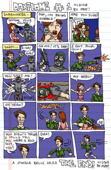
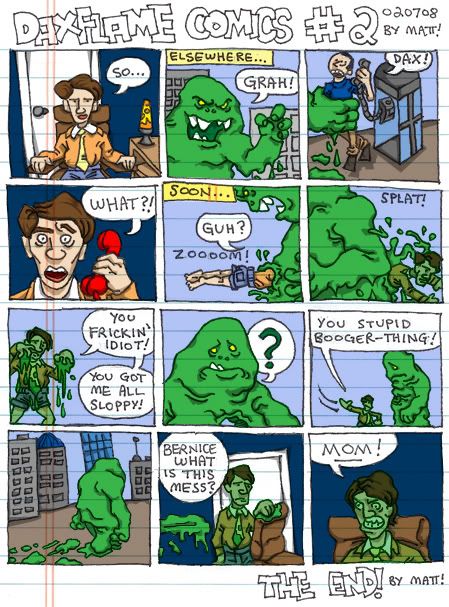
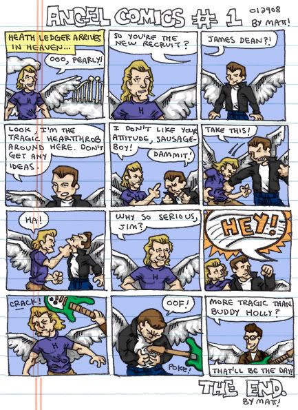
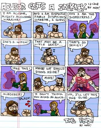
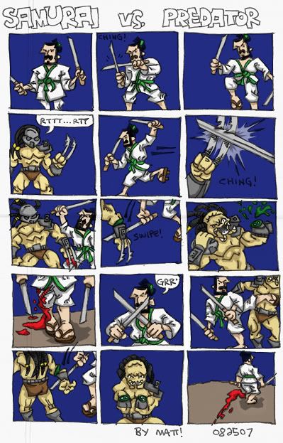
i go through periods when i draw a lot, usually not more a familiar character with whatever pen is lying around, sometimes as much as a 12 panel comic strip. almost all of it gets quickly thrown away. the medium of notepad doodles doesn't lend itself to preservation, which is partly why i'm able to be so prolific within it, while anything greater scares me away. a blank sketchbook page has become a daunting sight to me. i can’t help seeing it as something pure that a mistake would tarnish, as would the removal of such a mistake. a notepad page can be ripped away as soon as that one runaway line of ink topples it’s potential, where a sketchbook page lacking craft must remain intact, a lingering shrine to shame.

i worry that a doodle blog might make doodling as self-conscious for me as sketchbooks have made sketching. i can see myself being tempted to throw away even more doodles – or worse, doodle less to begin with – because, in producing content specifically for display, i’ll inevitably hold myself to a higher standard. it is conceivable that my vanity will lead me to opt for inexistent doodles over imperfect ones.

i’m hoping for the opposite effect, that while practice may not make “perfect,” it might build comfort. the idea is to learn to accept imperfection, the obstacle which has always hindered my artistic evolution.

if i can get comfortable enough producing mediocre doodles, maybe i’ll finally have cured my fear of looking foolish (at least in this domain), and maybe the foolishness, the mediocrity, will start to fade away on it’s own.